Come across the aphorism “sell in May and go away”? Perhaps heard reference to the “Santa Claus rally”? Many people believe there are seasonal patterns to share prices. Some months are typically good with prices going up, and some not so good with prices going down or sideways. Let’s look at some history using the S&P/ASX 200 Index.
This index shows the aggregate performance for the biggest (by market capitalisation, worked out by multiplying the number of shares on issue by the price per share) 200 Australian Stock Exchange (ASX) listed enterprises. This index only shows price movements (does not include dividends) and the larger companies carry more weight in the index than the not-so-large ones.
Of course, if the index of 200 companies is going up this does not mean all the companies in the index are going up. Only that a larger number of market capitalisation went up. Individual companies may have their own seasonal price patterns. However, let’s keep it simple and look at the S&P/ASX 200 Index (also known by its ASX code XJO).
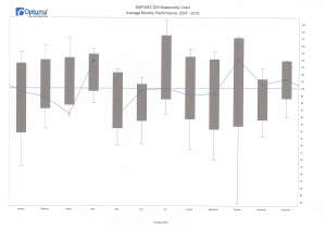
This chart shows the average (arithmetic mean) of monthly price movements for the index for the last 12 years (May 2006 to April 2018). The figures on the right edge of the chart show the average level of the index at the end of each month, using a figure of 100.0 as the starting point. So, if the average of the index at the end of December is 101.2 this means the average price increase for the month of December for the period examined was 1.2%. The figure for November is 98.4 and this means the average price decrease for the month of November for the period examined was 1.6%. The blue diamond above the April bar shows the result for April 2018 – a better than average one.
Based on the last 12 years the month of April has been a good one for the price of the S&P/ASX 200 index. April 2018 was a better than average one. Based on the last 12 years the averages for May and June have seen decreases. This certainly does not mean that May and June 2018 will be negative ones, only that May and June have been weak months on average over the last 12 years. No suggestion that any portfolio changes would be necessary.
We can look in more detail at these historical data in future articles. For instance, a different chart will show the best and worst performances for each month as well as the average. For something a bit outside the square, we can also arrange the data so it looks at performances on dates divided up on an astronomical basis (Aries, Taurus, etc.) rather than calendar months. Keep watching for future articles.
Please note this article is providing general advice and information. It has not taken your personal or financial circumstances into consideration, if you would like more tailored financial or investment advice, please contact us today. One of our advisers would be delighted to speak with you.